Business Day Premium - Redesign
Redesigning the future of Nigerian journalism.

Overview
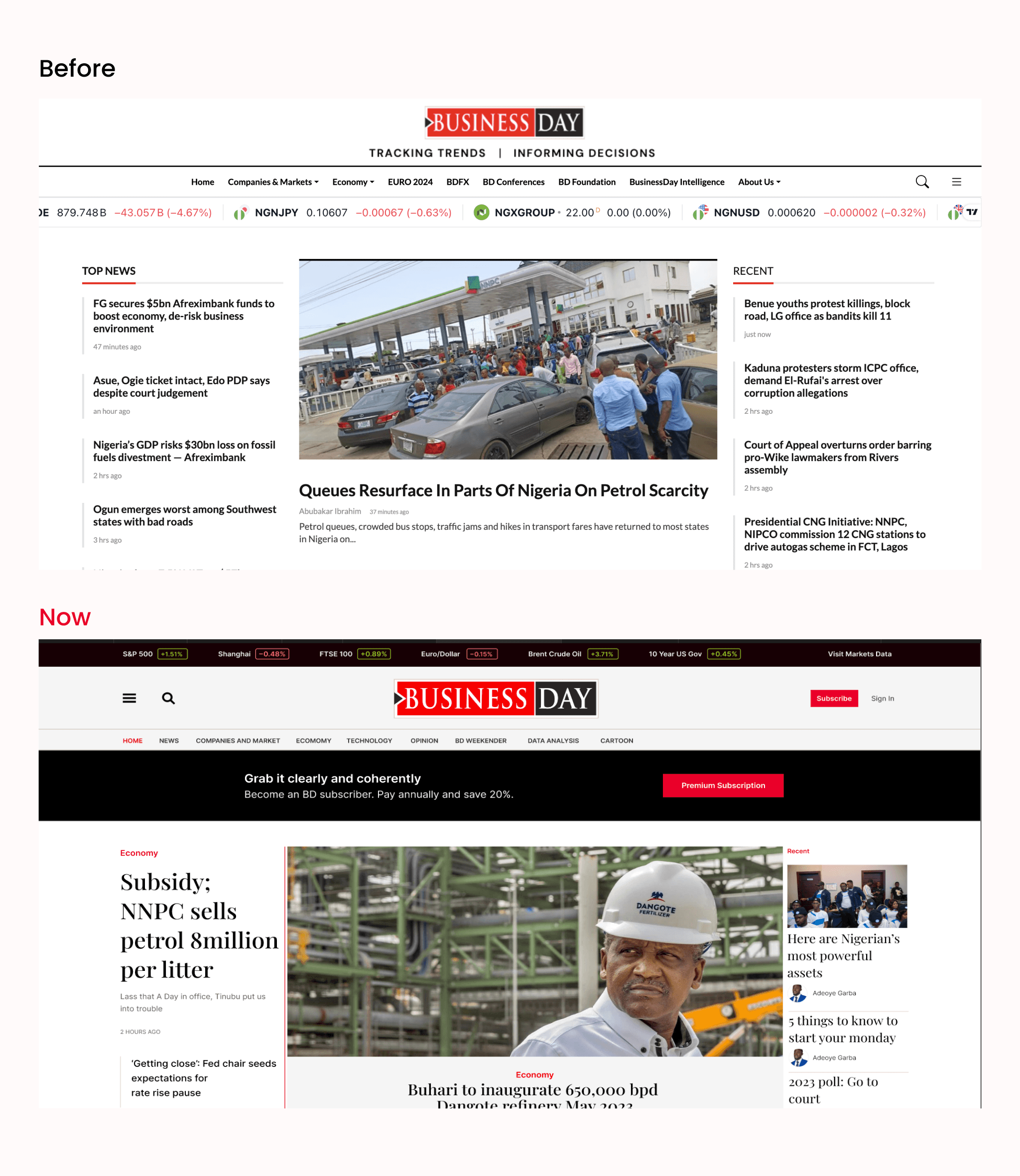
For decades, BusinessDay has stood as the voice of business and financial journalism in Nigeria. With a reputation built on truth, credibility, and editorial depth, it led conversations from boardrooms to classrooms. But while its content soared, its digital presence lagged behind. The website, a once groundbreaking portal was now clunky, inconsistent, and outdated. Pages took long to load. Readers struggled to find premium stories. The mobile experience? Barely functional.
It wasn’t just about aesthetics. It was about survival in a digital-first era.
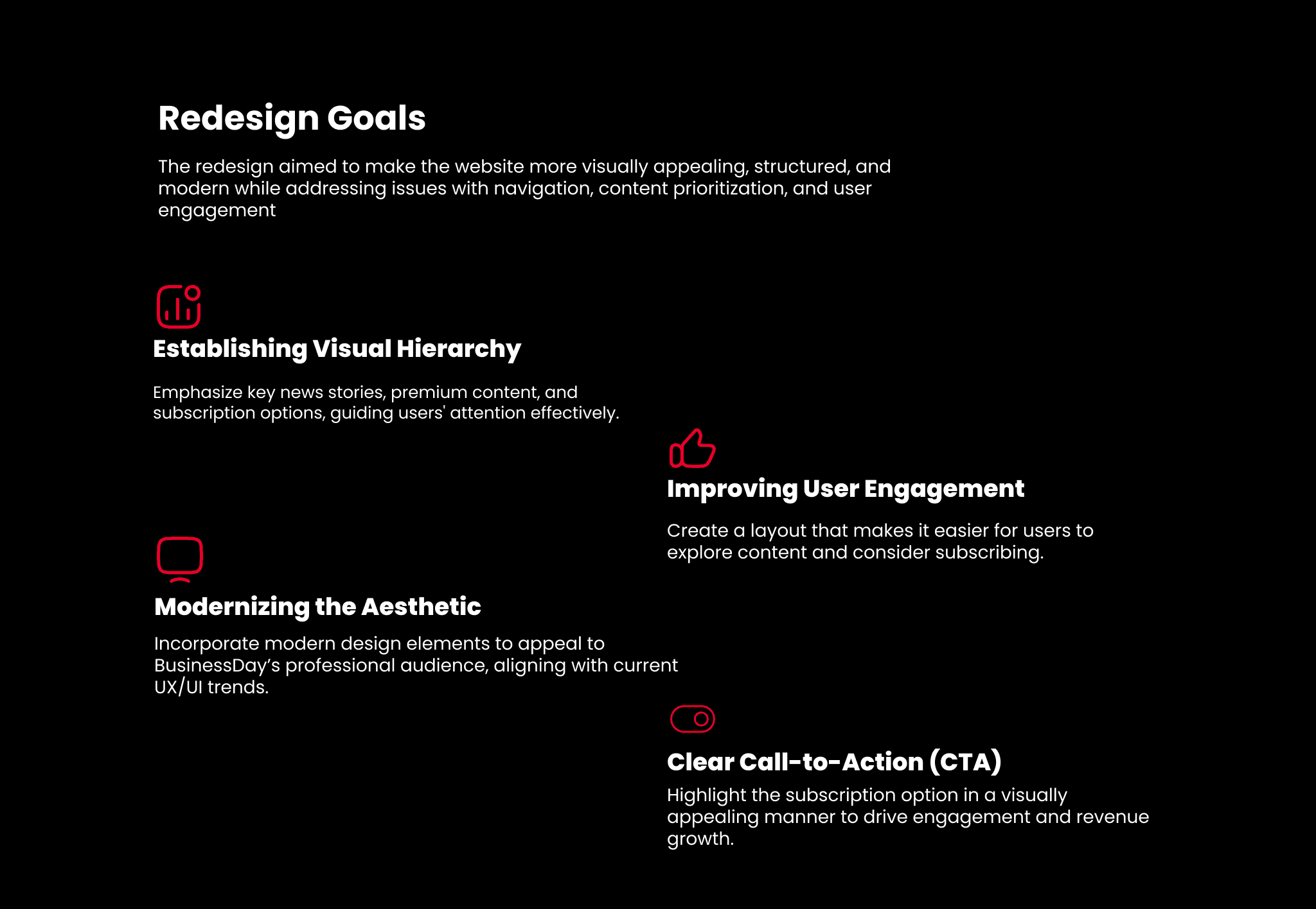
Reimagining BusinessDay for Today’s Reader
When I joined the team, one thing was clear: this wasn’t a redesign, it was a rebirth.
We weren’t just changing fonts and colors. We were preserving legacy while architecting a modern newsroom experience. A place where stories breathe, journalism shines, and users/Stakeholders feel at home, whether they’re in Lagos or London 😁
The Process
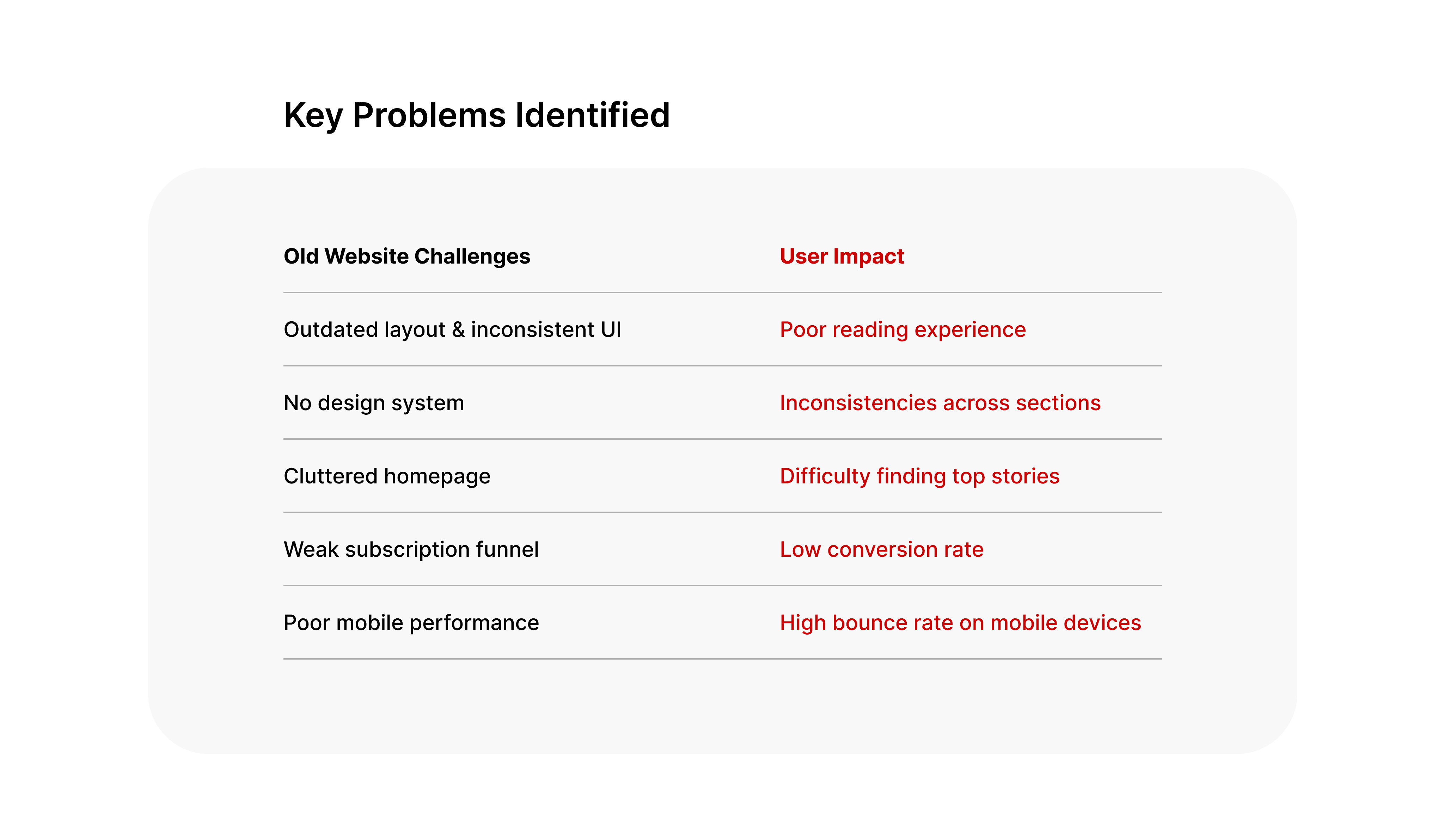
We immersed ourselves in the newsroom, the marketing desk, the subscriber data, and even social media mentions. We observed how editors published stories. We listened to readers rant about broken links, poor readability, and disjointed flows.
Insights Gathered
People loved the content but hated the experience.
There was no visual hierarchy.
The brand voice didn’t translate well in the digital space.
We needed to simplify, amplify, and clarify.
Design Process
A. Research & Audit
Reviewed competitor platforms: Quartz, Bloomberg, The Republic
Audited existing flows & gathered feedback from editorial and marketing teams
Identified critical UX issues and structural flaws
B. Wireframes & UX Flow
Simplified sitemap
Reorganized homepage for editorial prioritization
Designed modular article layouts for different content types
C. UI System & Visual Design
Developed a clean, bold design system using BusinessDay's core red + neutral palette
Designed consistent typography for editorial depth
Built scalable components: nav bars, cards, subscription banners, footers
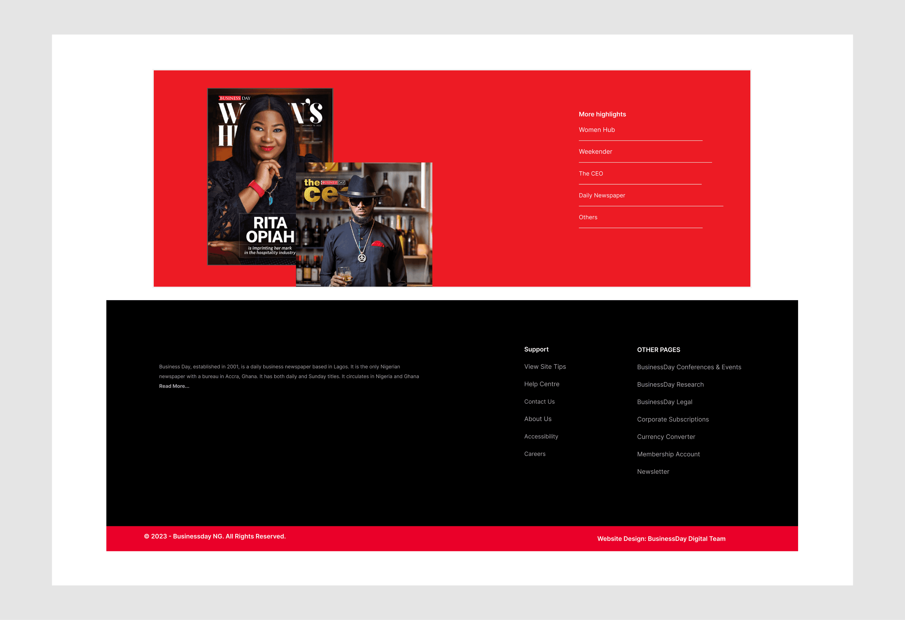
The Soul of the Site
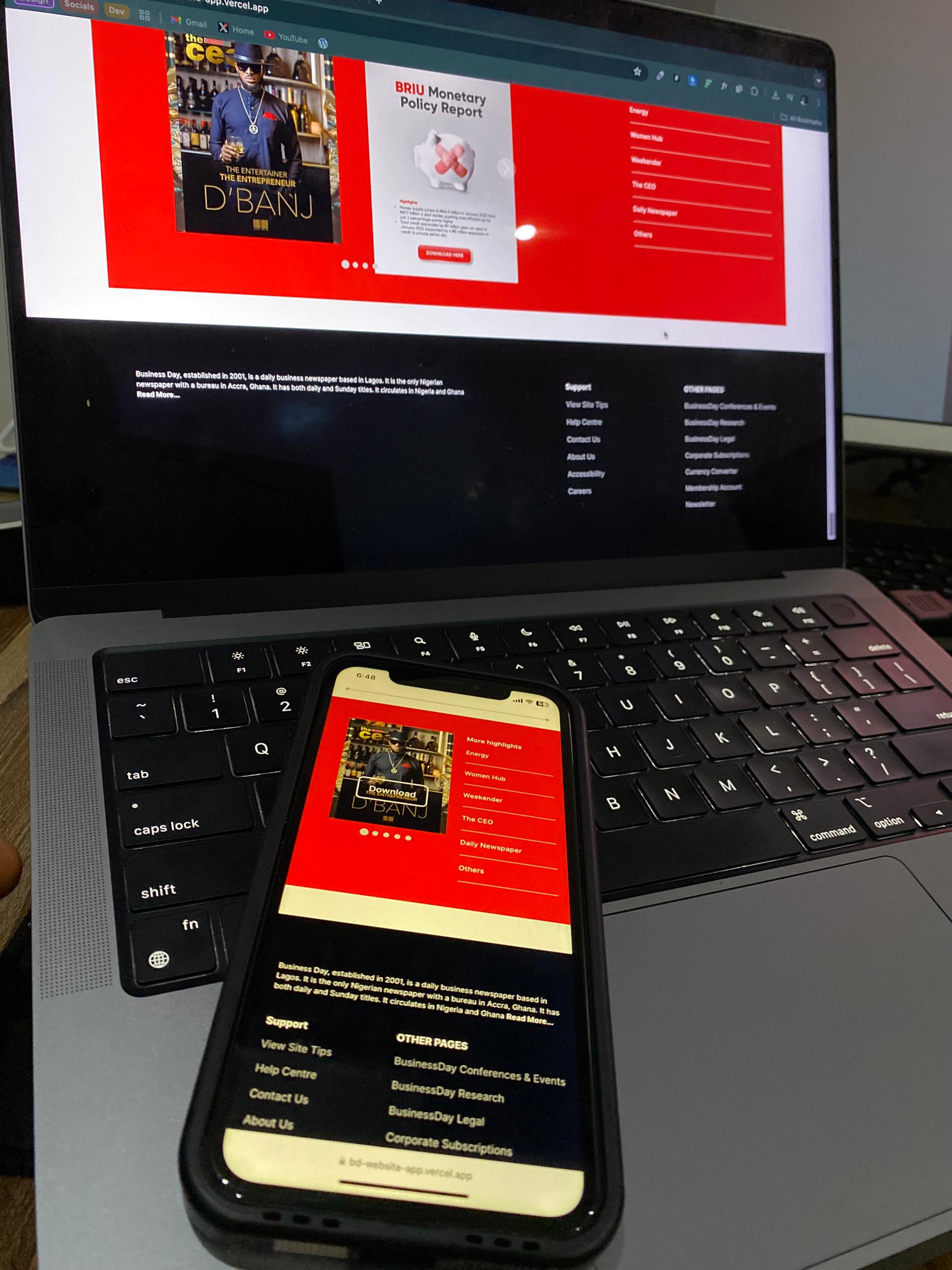
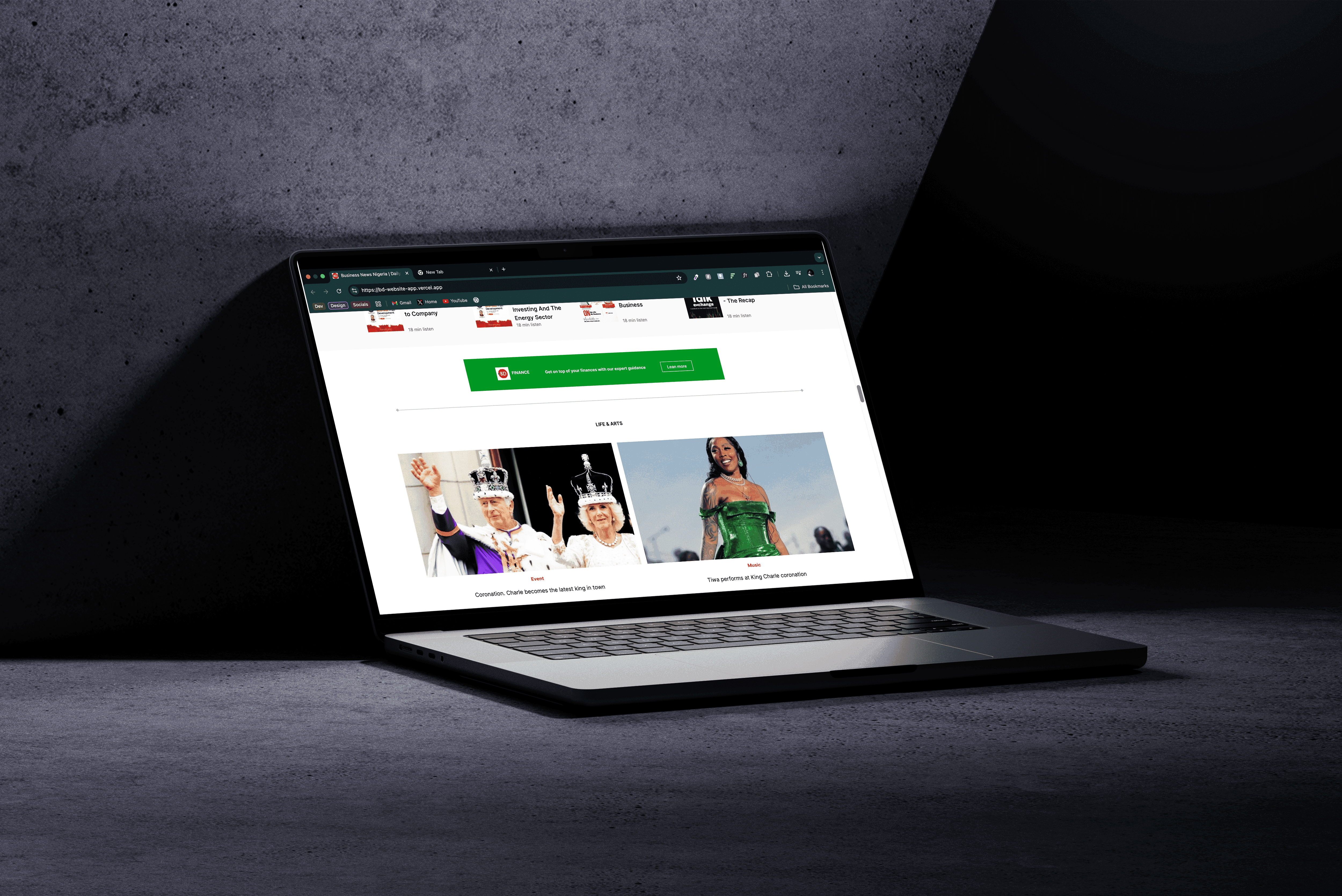
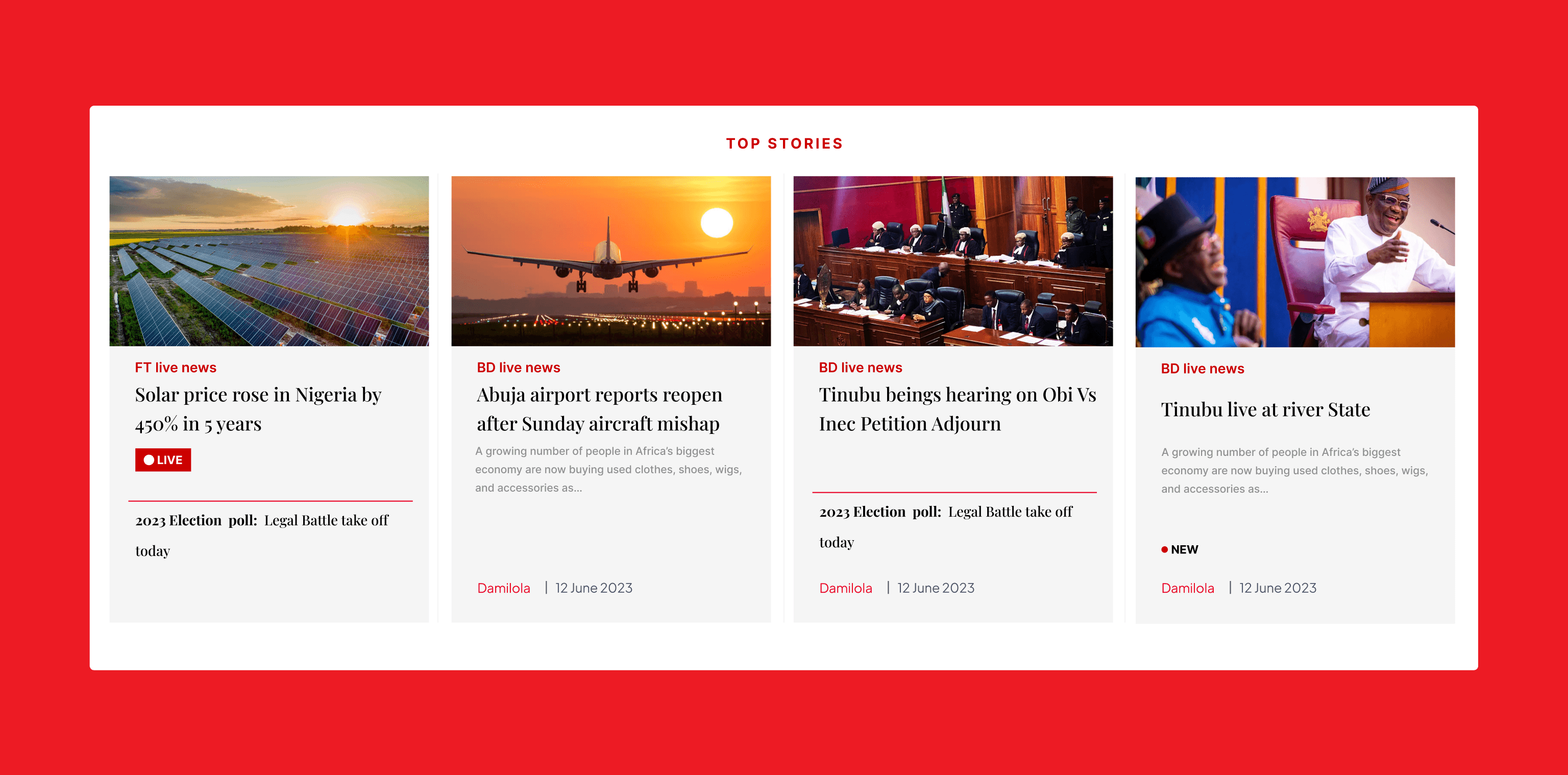
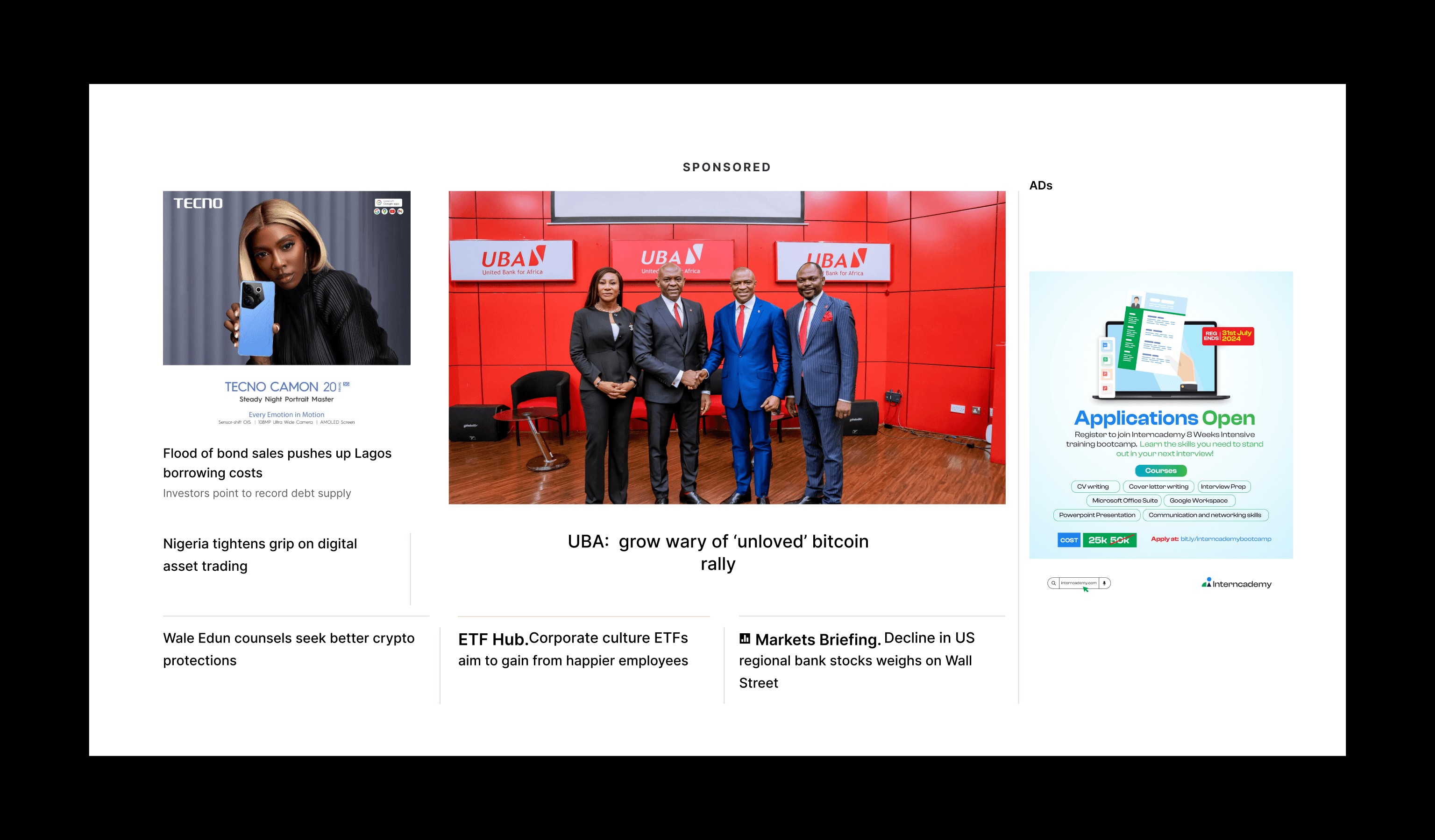
Homepage
A modern front page that mirrors a newspaper’s editorial energy. Hero stories take center stage. Clean navigation ensures users don’t get lost in noise.
Article Pages
Minimal, immersive, and distraction-free. Because the story matters. Readers now enjoy cleaner type, smart related links, and a clear content path.
Subscription Flow
We transformed subscriptions from friction to flow. Clear tiers, compelling benefits, and subtle nudges. Conversion made intuitive.
The redesigned BusinessDay website embraces a clean, modern, and editorial-forward design that reflects the brand’s authority in business journalism. The layout is structured around clarity and content hierarchy balancing strong headlines, intuitive navigation, and generous white space to improve readability. A modular card-based system allows for flexible content presentation across desktop and mobile, while the muted color palette with accents of BusinessDay’s signature red reinforces brand recognition. Every component, from article pages to the subscription flow, is optimized for user engagement, accessibility, and editorial ease creating a seamless experience that aligns with the needs of a digital-first audience.
This redesign was more than a facelift. it was about aligning user experience with editorial excellence. Working with the BusinessDay team gave me a chance to blend structure and storytelling, creating a system they can evolve with.