Karot
Redefining how kids learn money management.
Overview
Karot is a mobile app designed to help students save, complete tasks, and grow their financial literacy while enabling parents to guide and reward them. I collaborated as a Brand and Product designer with karot team to bring this idea to life through a fun, intuitive, and responsible mobile experience.
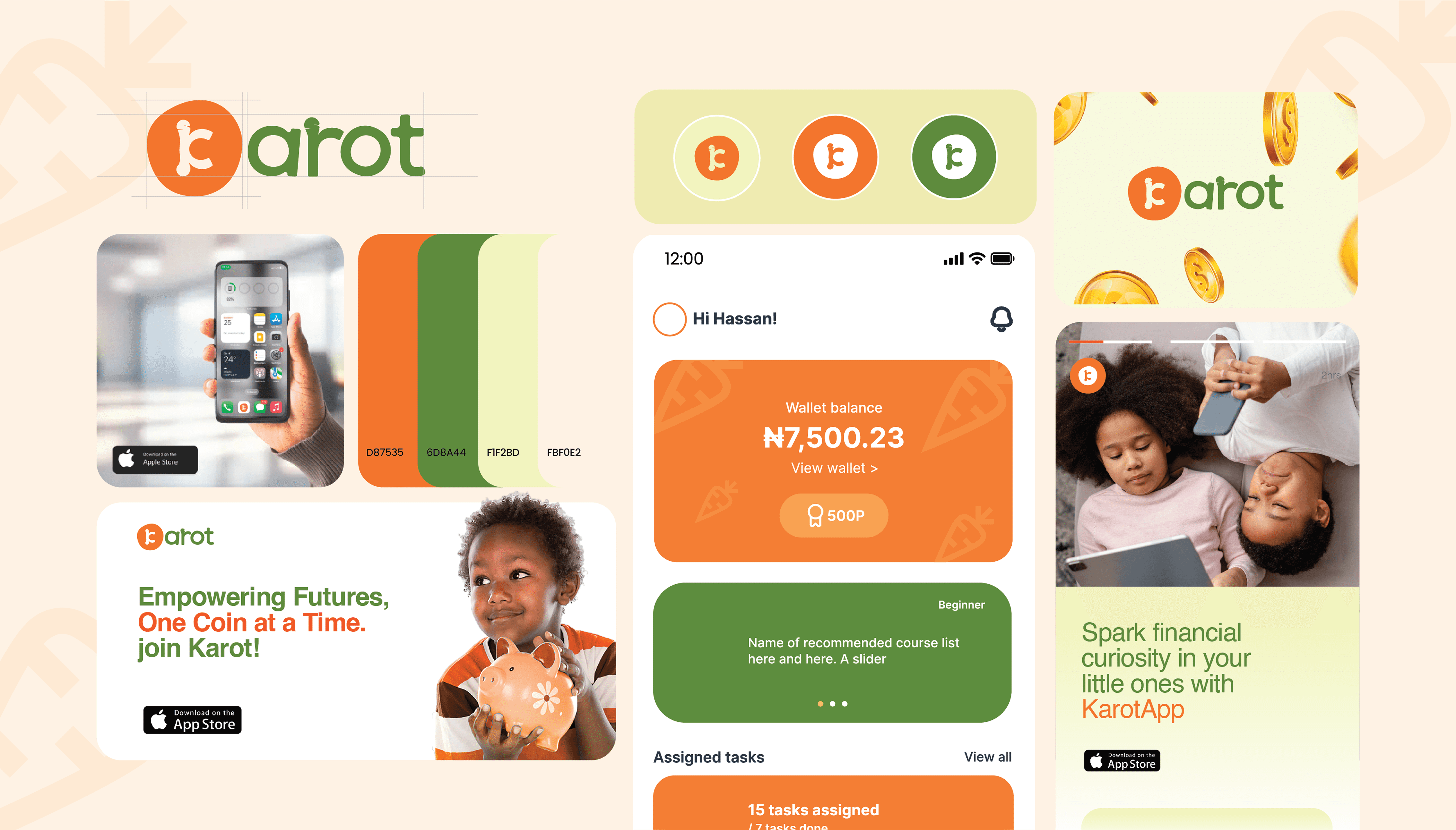
🥕 The Visual Identity of Karot
The creative direction for Karot was inspired by the idea of growing financial habits in children, using a playful, warm, and trustworthy visual system. At its core, the identity is built around familiar metaphors: the carrot (growth, learning, reward) and a distorted circle that symbolizes a coin a nod to savings, small wins, and the core theme of kid-friendly finance. This imperfect circle reflects how children are just beginning to understand the value of money imperfect, but full of potential.
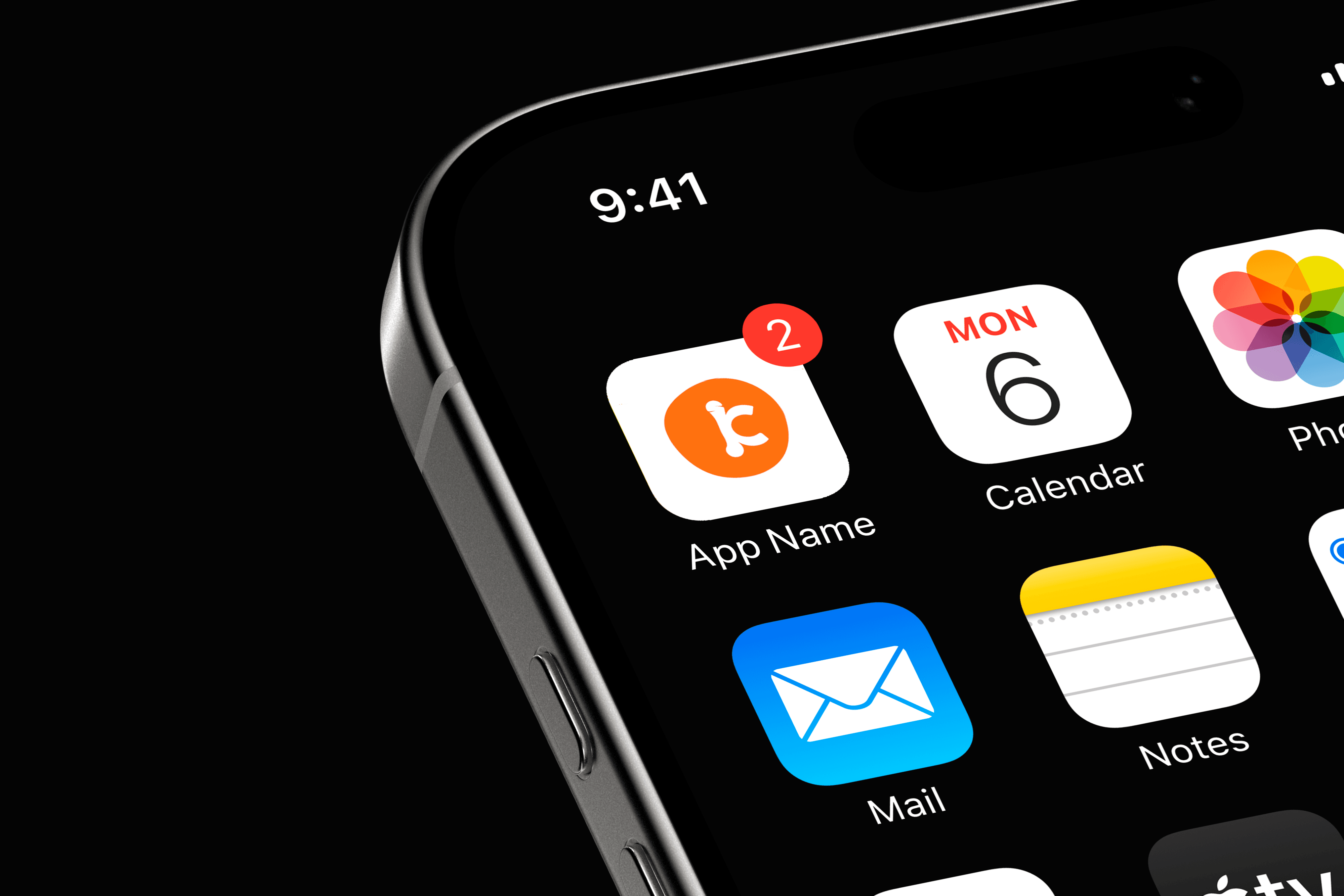
The logo features a stylized "K" formed into a carrot shape, while the supporting color palette, anchored in vibrant orange and leafy green,balances energy with trust. Soft, rounded typography and minimal, approachable iconography keep the tone inviting. Overall, the creative direction combines structure and spontaneity, speaking to both kids’ curiosity and parents’ need for assurance, making Karot a brand that grows with its users, one coin at a time.
🧩 The Challenge
In a world of digital payments, children rarely interact with physical money, and that’s a missed opportunity to build financial discipline early. The Karot team wanted to solve this by building a mobile app that helps kids learn, save, and grow, while giving parents the tools to nurture those habits safely.
But designing a finance app for kids isn’t straightforward. We had to address:
How do we create an interface that speaks to children without feeling childish?
How do we build financial trust while staying engaging?
How do we create an experience kids want to return to without it feeling like school?
Design Approach
1. Understanding the Users
We were designing for two personas:
Students (ages 8–18): needed intuitive, minimal, colorful interactions.
Parents/Guardians: needed oversight and confidence in the product's purpose.
The UX approach focused on creating task-based journeys (chores, goals, rewards) that promote a sense of progress for the student and control for the parent.
2. Mobile UX & UI Design
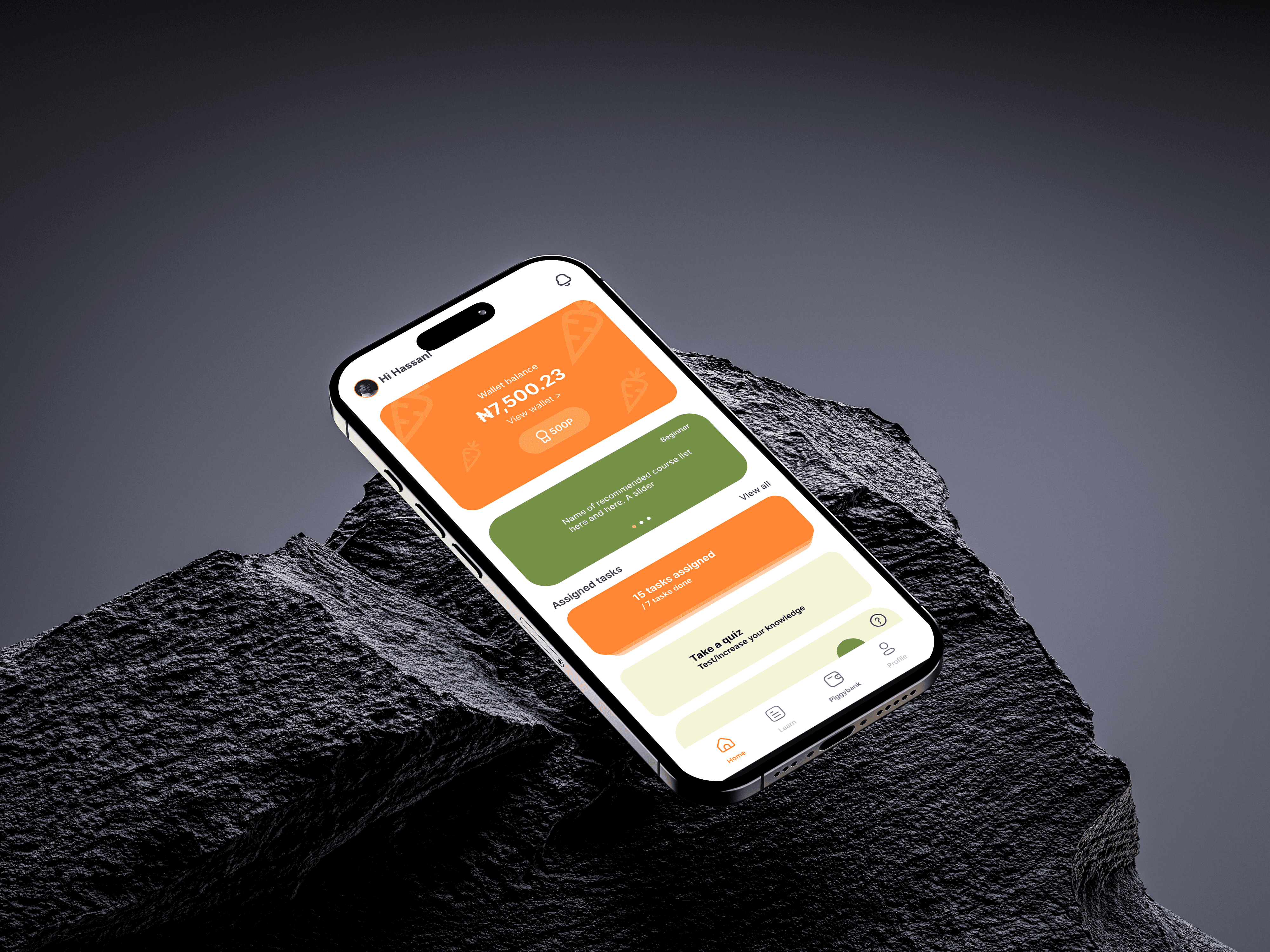
The app was designed to feel safe, encouraging, and rewarding. Core design principles included:
Clear task cards for earnings and goals
Fun progress feedback (e.g., carrot meter = savings growth)
Personalized avatars and profile screens
A colour system inspired by growth, warmth, and responsibility
3. Iteration & Microinteractions
Early testing with real users (kids + parents) helped us tweak key elements:
Added daily nudges to promote usage
Simplified task creation to just 2 taps
Improved feedback system after completing goals
The onboarding flow for Karot was designed to be intuitive, friendly, and inclusive, catering to both students and guardians right from the first tap. With a clean layout, soft colour transitions, and clear hierarchy, each screen guides users through account creation, sign-in, and password recovery with minimal friction. I emphasized accessibility and trust through simple language, playful icon cues, and consistent use of brand colours making the onboarding feel less like a chore and more like an invitation to a meaningful journey in financial literacy.
In designing this experience, the core challenge was to strike a balance between financial education and user motivation, two critical pillars for our young audience. I approached this by embedding a reward-driven learning model within the app, where users are not only encouraged to take courses relevant to their growth but also track their progress in real-time. The learning module was structured to feel bite-sized and approachable, reducing intimidation while encouraging daily engagement.
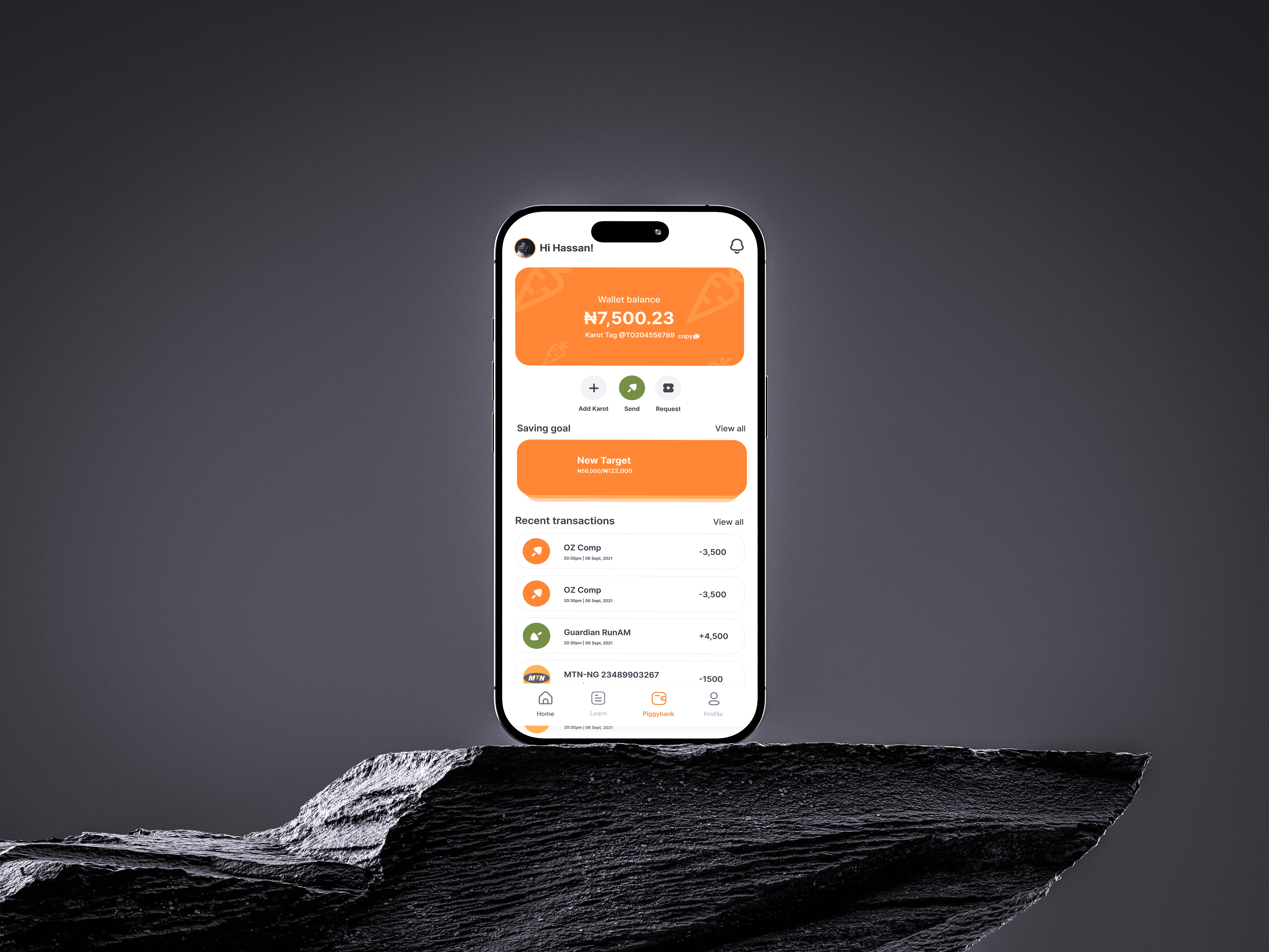
On the financial side, the piggybank experience was designed to mimic real-world saving behavior but in a simplified, visually rewarding format. By surfacing wallet balance, savings goals, and transaction history in one glance, we aimed to build financial awareness and create a sense of ownership. Additionally, I introduced social and motivational triggers like the leaderboard and profile stats not just for bragging rights but to reinforce positive reinforcement loops, making both learning and saving part of an engaging daily routine.
1. Breaking Learning into Manageable, Visual Chunks
I designed the “Course Details” screen to reduce cognitive load. Instead of throwing a syllabus or heavy text, I broke the content down into:
A clear header card that highlights the course goal, reward system (points), and task count all upfront.
A vertical list of locked lessons to signal progression without feeling cluttered. The uniformity in lesson titles (“Welcome to the Course”) acts as placeholder structure but shows repetition and flow.
Why this matters
Users often drop off if they don’t immediately understand what’s next. We wanted the user to see a clear “pathway” into the course
2. Simplifying the Course Pitch
On the course info screen, I focused on accessibility and clarity:
The top card uses large typography and clear visual hierarchy to communicate the course title and purpose at a glance.
Course benefits are listed as icon + text pairs (e.g., 100% online, self-paced), reinforcing simplicity
Repeating the course description in different sections was intentional users scan, don’t read, and repetition reinforces message retention.
Why this matters
I wanted users to understand the value of the course without scrolling endlessly or reading dense paragraphs. Each design choice here reinforces trust, ease, and user control.
3. Progress = Motivation
On the “My Statistics” screen, the goal was to make growth feel rewarding:
“Congrats” message at the top acts as a psychological reward a small celebration to mark progress.
Bar chart of visits gives learners insight into their study habits, turning self-awareness into a tool for accountability.
Score cards (Highest and Lowest) introduce an informal benchmark system pushing users to improve without external pressure.
Time graph for most frequent learning hours supports self-paced learning and helps users find their personal productivity window.
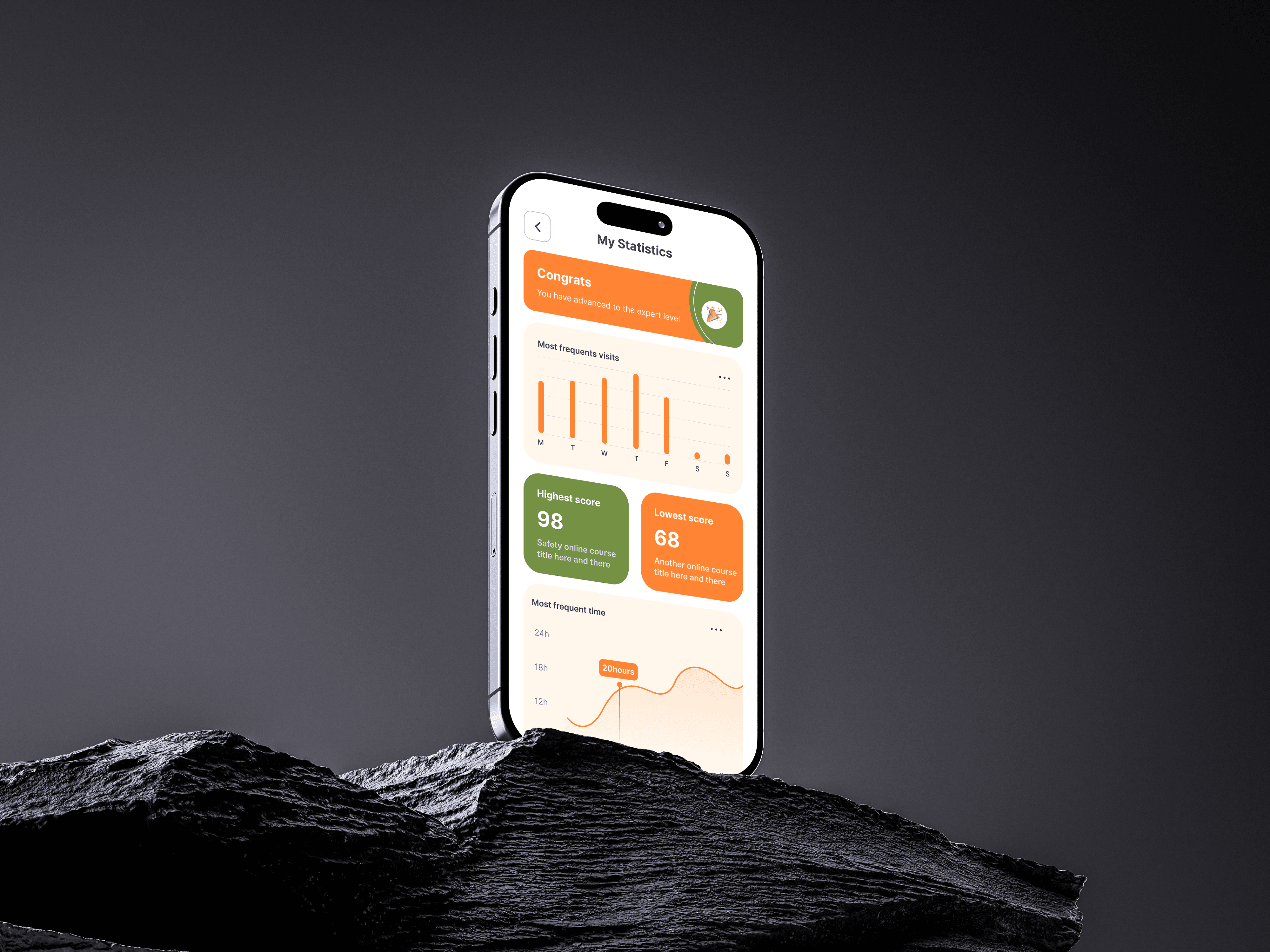
Why this matters
Gen Z and young adult learners are data-conscious. But they also need visual cues to emotionally connect with their progress. I designed these stats to feel like personal insights, not just analytics.
Conclusion
Designing the Karot learning experience wasn’t just about how appealing the UI seem, Yes, I can brag about that too but it was more about understanding behavior, motivation, and how people grow.
From structuring lessons to visualising progress, every decision was rooted in one goal:
Make learning feel simple, personal, and rewarding.
By blending thoughtful UX with friendly UI, I built a system that not only guides users through content but encourages them to return, reflect, and improve. This project reaffirmed a core belief:
"The most effective educational tools are the ones that put users in control of their journey while quietly cheering them on."