Renmoney Bank- Redesign
A User-Centered UI and UX Overhaul for a More Intuitive Banking Experience
Overview
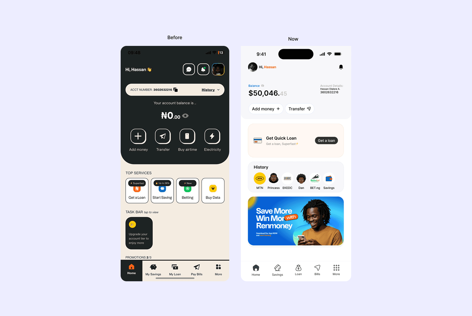
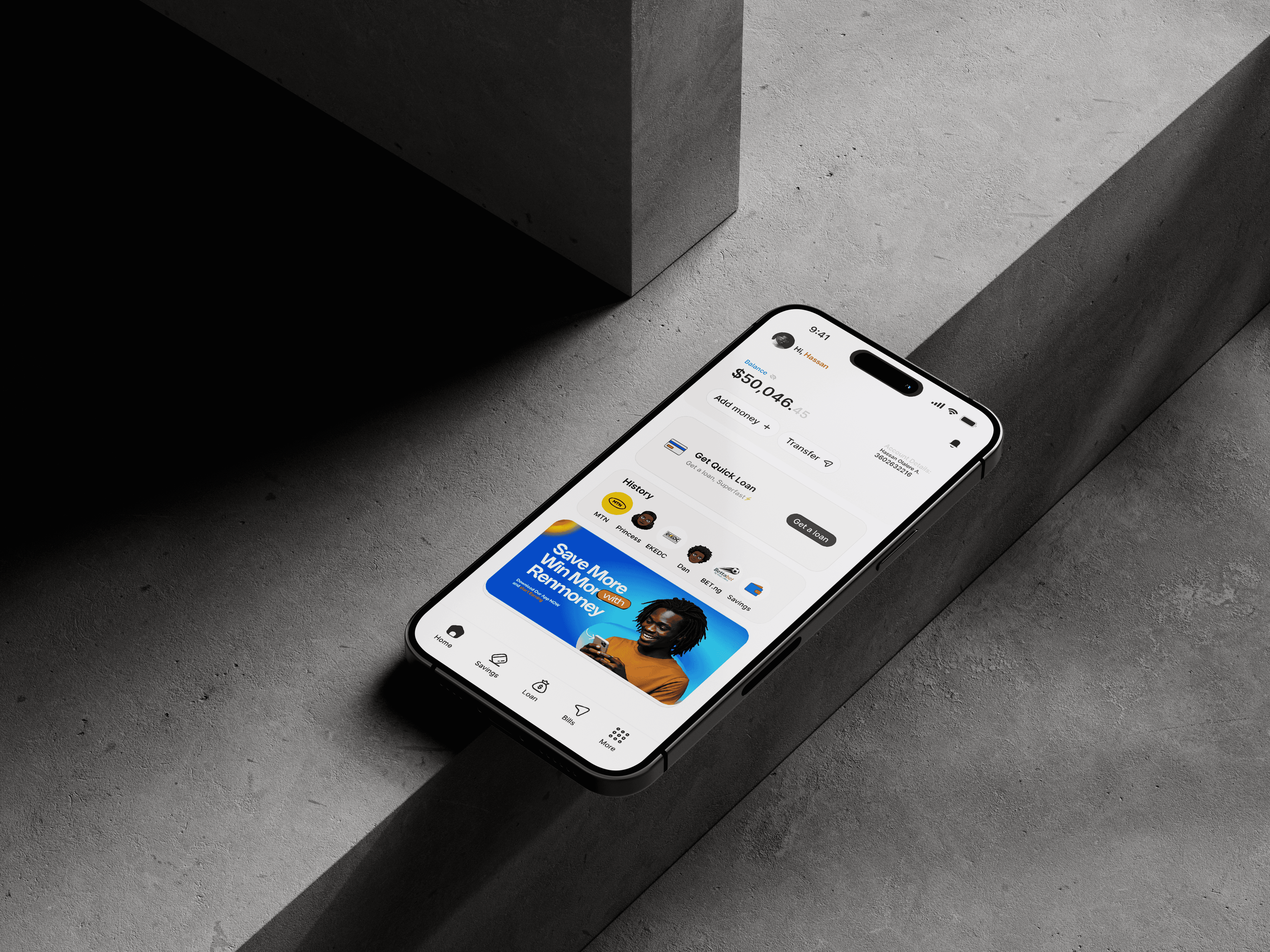
Renmoney is a leading fintech company in Nigeria that offers personal and business loans, savings, investment products, and other banking services through its mobile app . Despite its robust offerings, the app faced usability challenges that hindered user engagement. I came up with a redesign of the Renmoney app, focusing on user-centered design principles to enhance usability, visual hierarchy, and accessibility, thereby improving overall user satisfaction.
Why the Redesign
One night, while searching for a loan app, I downloaded Renmoney. But something immediately felt off. The app’s branding looked completely different with what I had seen on the website. This made me question if I had the right app. The signup process was confusing and felt unnecessarily long. I got stuck midway, frustrated, and ended up falling asleep before completing it the next day. That experience sparked this redesign to fix the broken experience and reimagine how Renmoney could better serve users with a clearer, more intuitive interface that reflects the strength of its brand.
The Problem
Inconsistent Branding:
The app’s visuals didn’t match the official Renmoney visual, leading to user confusion and reduced trust.
Visual Clutter:
A lack of visual hierarchy and disorganised layouts made navigation overwhelming.
Clunky Signup Flow:
The onboarding process was lengthy and unclear, causing frustration and abandonment.
Poor Accessibility:
Low contrast and small tap targets limited usability, especially for users with visual or motor impairments.
Overall User Experience:
These issues combined resulted in a poor user experience.
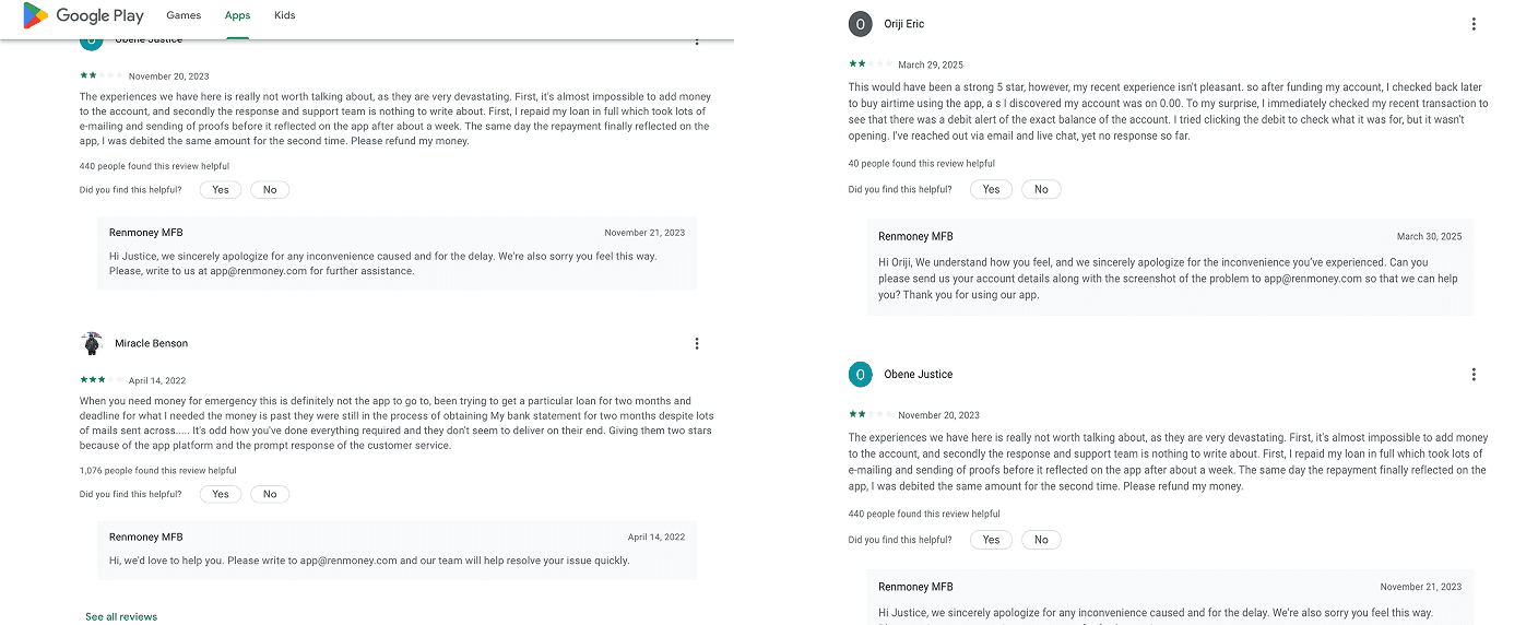
Below are screenshots of some bad reviews the existing app got on Google PlayStore and the Apple App Store.
The Solution
To address the fragmented experience across the Renmoney mobile app, I applied a user-centered redesign approach focused on clarity, consistency, and usability. The goal was to transform the app into a product that feels modern, trustworthy, and easy to use while preserving its core financial functions.
Visual Consistency: Rebuilt the design system with consistent layouts, colors, typography, and iconography to reinforce brand identity and user trust.
Simplified Navigation: Streamlined the app’s structure to make core tasks like requesting loans, adding money, or paying bills more accessible with fewer taps.
Minimalist Design: Reduced clutter across screens to improve focus and make important actions stand out.
Guided Interactions: Introduced clear microcopy, feedback states, and step-by-step flows to reduce user confusion.
Improved Accessibility: Enhanced contrast, touch targets, and text legibility for a more inclusive user experience.
Modern Aesthetic: Updated the visual language to match industry standards and user expectations for fintech apps.
Onboarding Screens
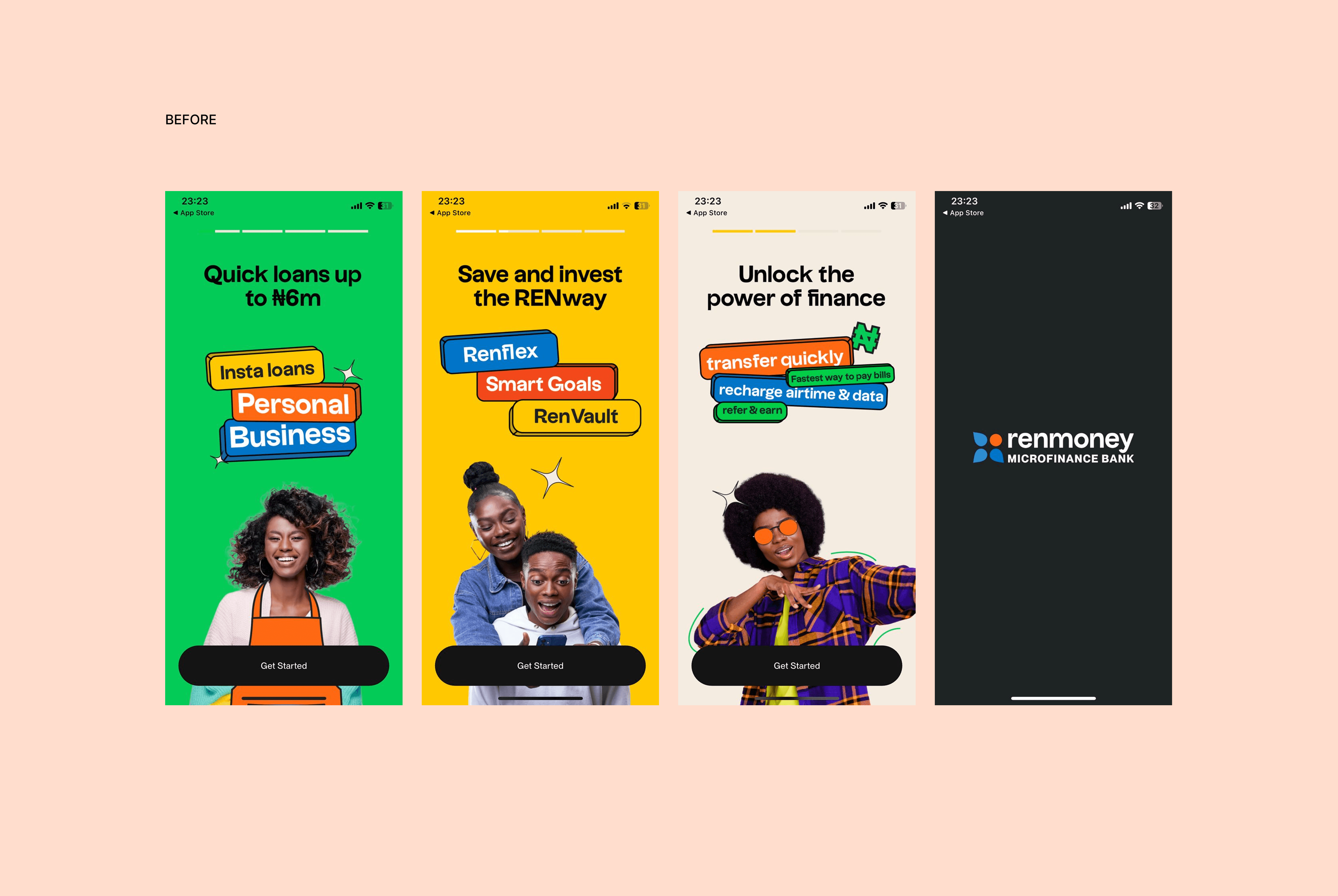
In financial services, trust is everything. This newly purpose onboarding design communicates transparency through clear typography, real-life photography, and minimal distraction. I want users to feel confident and reassured the moment they open the app. No exaggerated claims or flashy distractions, just straightforward value.
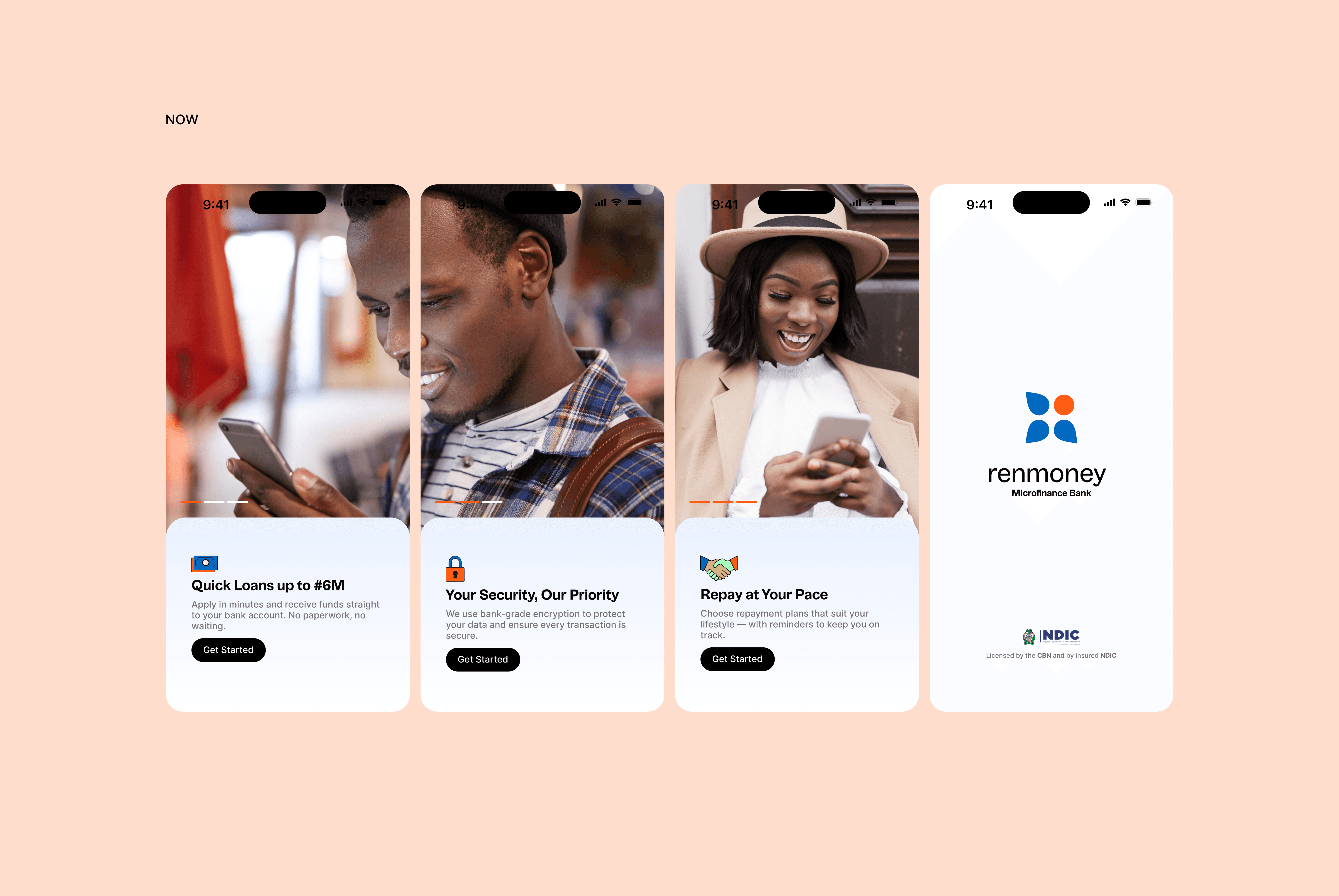
Strenght
1. Professionalism and Trust
2. Clear Messaging for Action-Oriented Users
3. Scalable for Different User Segments
4. Accessibility and Usability
5. Visual Longevity
Sign up
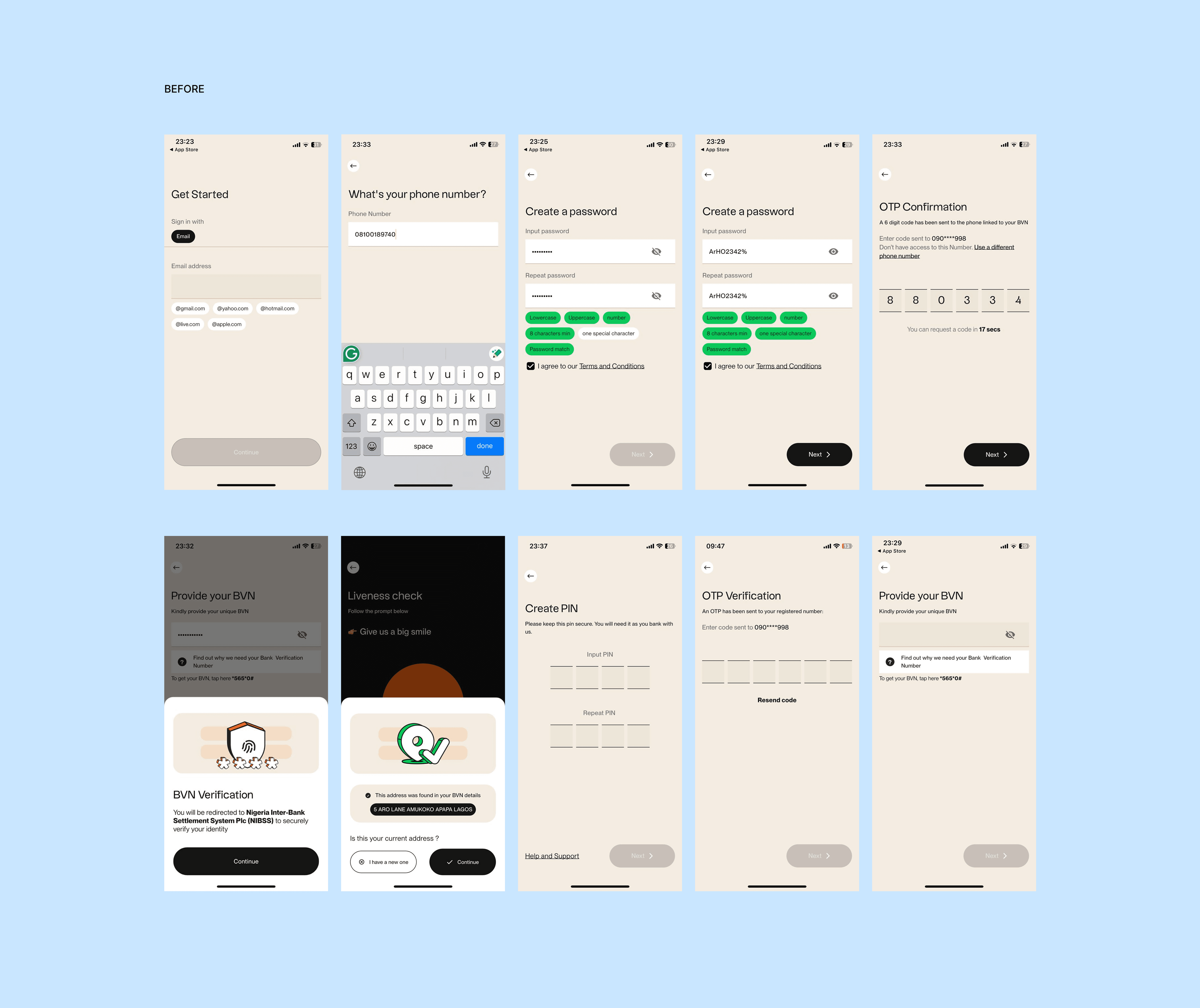
A sign up flow, most especially in fintech should be fast, clear, and trustworthy. The original Renmoney onboarding was cluttered, inconsistent, and lacked user guidance creating friction at the very first touchpoint.
This redesign embraces a minimalistic, step-by-step approach that prioritizes clarity, consistency, and trust. By removing distractions and simplifying the experience, the new flow makes it easier for users to sign up confidently
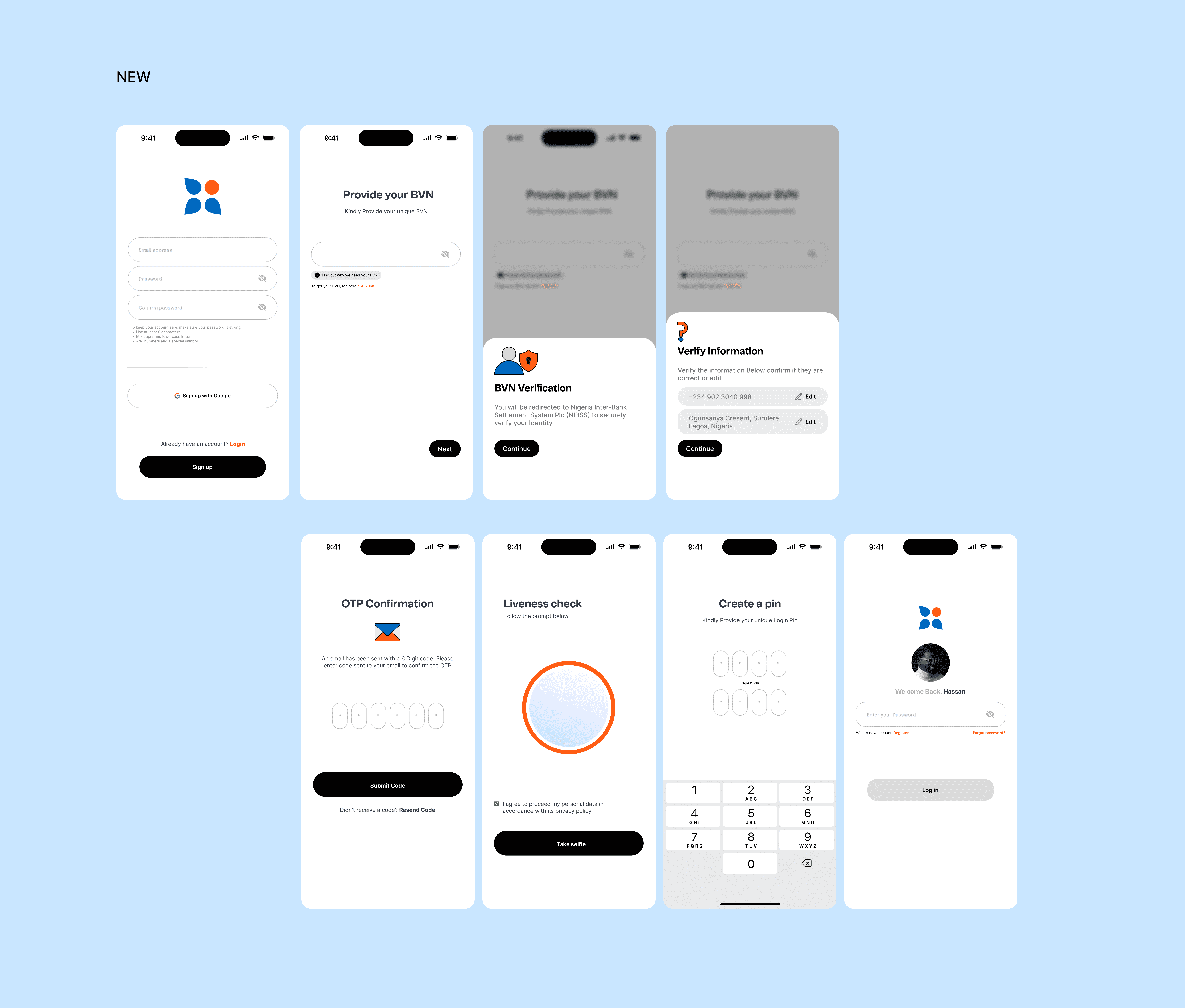
The redesigned flow is not only more visually appealing but also significantly more functional. It streamlines the previously lengthy and confusing process into a seamless, user-friendly experience without compromising on essential steps.
By prioritizing clarity, consistency in visual identity, user trust, and modern UX principles, the new design improves completion rates and delivers a stronger, more professional first impression of the Renmoney brand.
Menu Bar
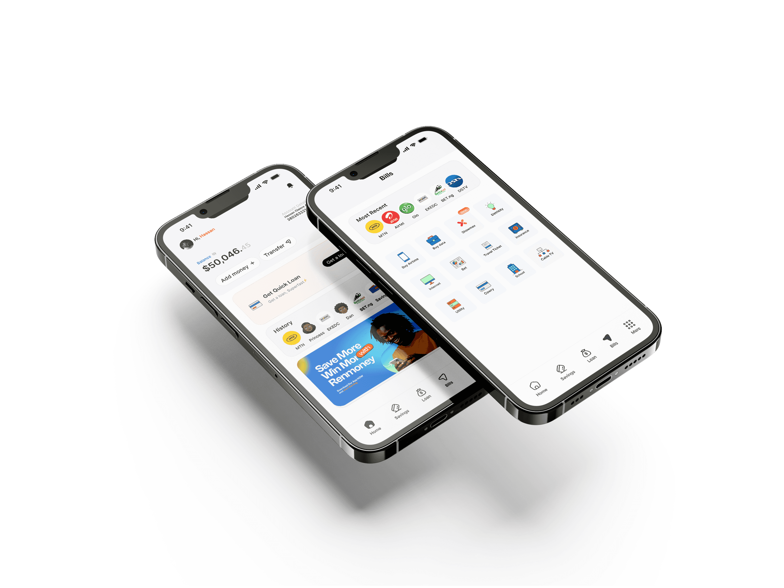
Challenge
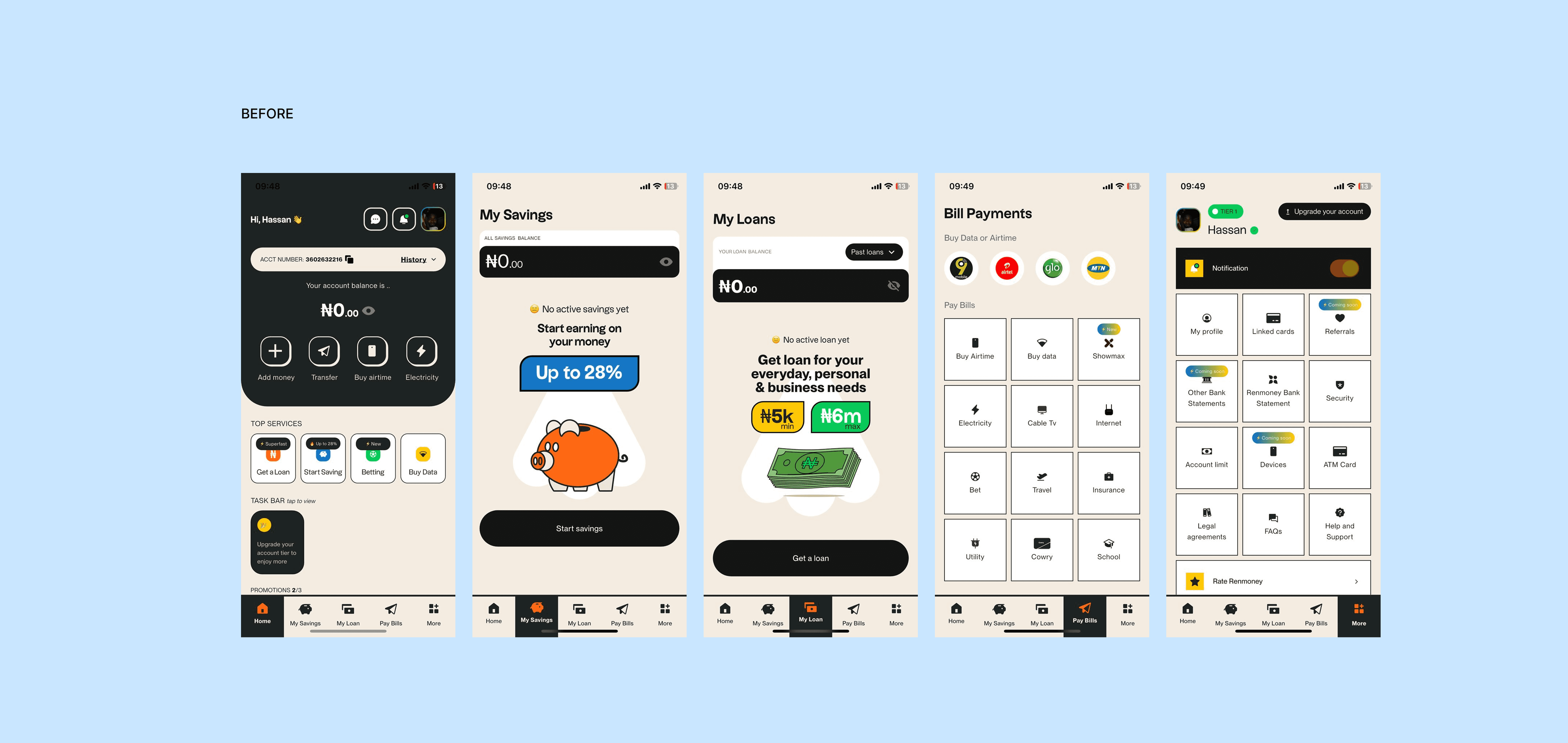
User Experience: The Previous version displayed a zero balance prominently without context, which discouraged users, and its icon-heavy navigation lacked clear labels, leading to confusion.
Visual Appeal: The dark theme and inconsistent button styles (e.g., varying colors, faint icons and sizes) made the app feel outdated compared to competitors.
Functionality: Features like savings and loan options were underutilised due to poor presentation, and the "Bills" section overwhelmed users with a grid of unlabeled icons.
Personalization: The lack of user-specific data (e.g., account holder name) reduced the app’s relevance to individual users.
Solution
The redesign focused on creating a user-centric, visually appealing, and functional design. By addressing usability issues, enhancing visual appeal, and integrating personalized features, the company not only improved user satisfaction but also boosted key financial activities which serves as a benchmark for future updates, emphasizing the importance of continuous user feedback and modern design principles in the financial sector.

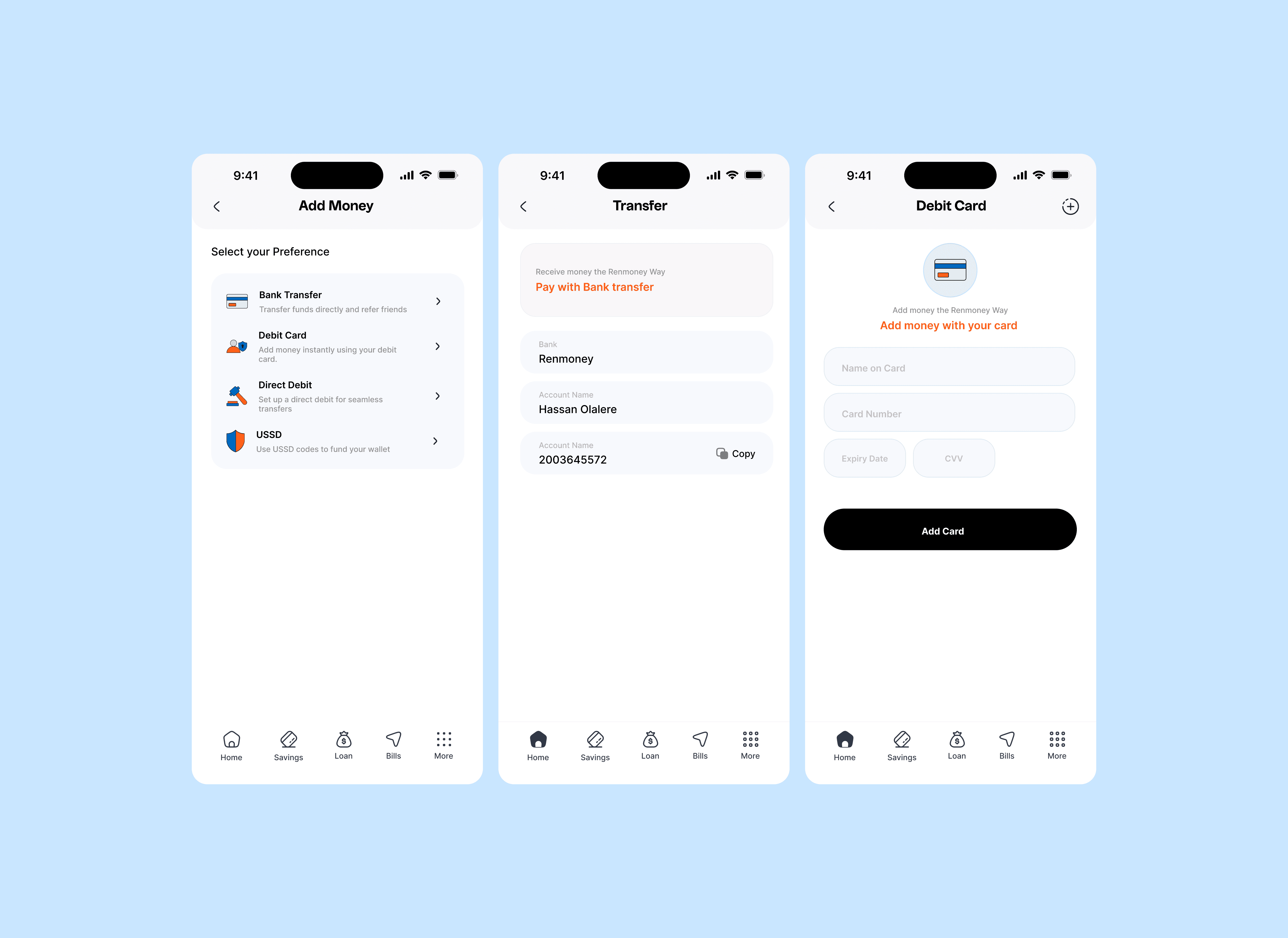
Add money
PlayStore reviews revealed a persistent issue: users found the "Add Money" process confusing and cumbersome. This Redesigned "Add Money" process demonstrates this impact of addressing user pain points through thoughtful design. By simplifying options, giving multiple alternatives providing clear guidance, and enhancing visual feedback
Icons
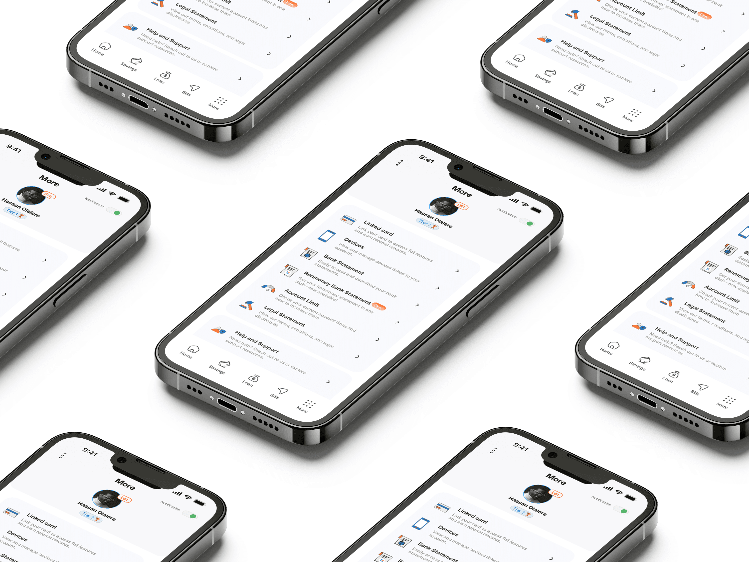
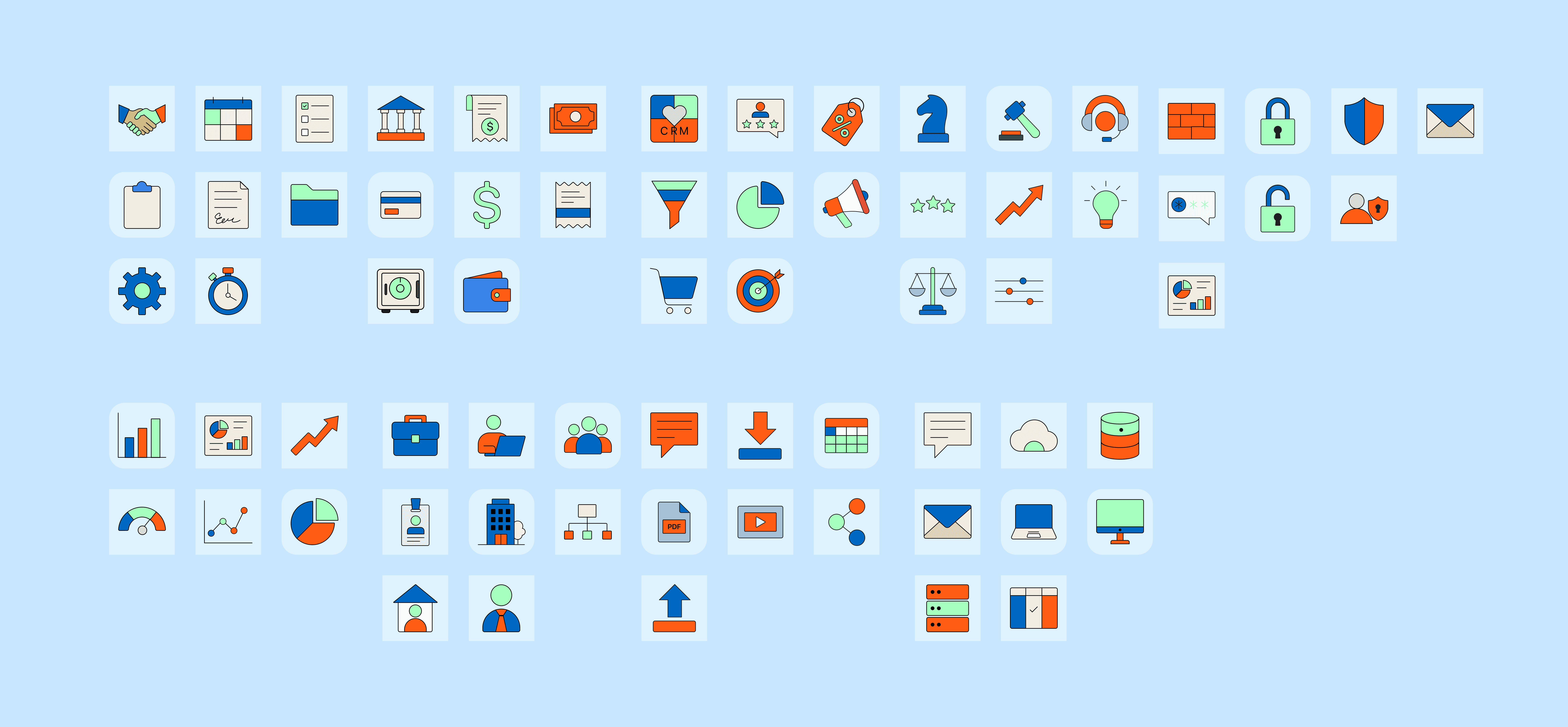
This unique Buzicon icon set successfully enhanced Renmoney’s app usability and brand consistency, proving the value of custom design in mobile banking. This futher strengthen importance of tailored visual elements in driving user satisfaction and engagemet
I Also created a Promotional Advert "Save More Win More" graphic for the app, this amplified Renmoney’s campaign by combining visuals, clear messaging, and consistent branding.

Conclusion
This project emphasize the importance of iterative design, user feedback, and strategic branding in enhancing digital banking experiences. The streamlined sign-up process, modern dashboard, and simplified financial interactions not only boosted engagement but also positioned Renmoney as a competitive player in the mobile banking space. Moving forward, the success of this redesign sets a strong foundation for future updates, emphasizing the need for continuous improvement to meet growing user expectations and maintain market relevance.